
 Back to Blogs
-
Digital Marketing
, Hotel Booking Technology
, Web Design
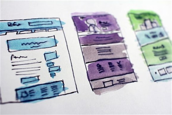
2019 Mobile Trends: Why Making Your Website for Mobile Matters
Browsing the web through a mobile device is currently one of the most common methods. In an increasing market looking for a customized experience; designing for mobile should be on top of every web-designers mind.
Here are some tips to create a better mobile experience for your guests.
Buttons need to work
Now, this might sound obvious, but really the focus here is where that button is located on the screen. Ensure that the button is easy to reach for a user that is both left and right-handed, but making centered and wide enough.
Photos and text are where they should be
Ensuring that your website is developed for responsive screens is the current standard. What this means is that it will look good and function well on any device and any browser.
Speed matters
It was found that if a page takes more than 3 seconds to load, the bounce rate rises to 53 percent. What does this mean? Basically, if your site hasn’t been optimized for a mobile device and takes more than 3 seconds to load, those potential customers just left to find a different site. Making sure that your website is optimized for both responsive as well as speed is key in digital success.
Mobile payments are the future
As mobile security becomes safer and safer, users are shown to be making purchases on their devices. Make sure that it is easy for those users to check out on their phones, through both getting to the payment and the actual process to pay.
We at Digital Hospitality know what drives users to book a room through your site. Contact us today for a conversion on how we can help.
Keep Reading


 Prev Post


